Design

Mobility of the Future —

Mobility of the Future —

Mobility of the Future —

Mobility of the Future —

Mobility of the Future —

Mobility of the Future —

Mobility of the Future —

Mobility of the Future —

Mobility of the Future —

Mobility of the Future —

Mobility of the Future —

Mobility of the Future —

Mobility of the Future —

Mobility of the Future —

Mobility of the Future —

Creating the all-new Lynk & Co app for seamless vehicle control, car sharing and borrowing.
Client
Lynk & Co
Location
Amsterdam, Netherlands — Gothenburg, Sweden
Role
Product Designer
Year
2021 — 2023
Awards
Winner, Red Dot Design Award 2023

Introduction

Lynk & Co aims to revolutionise the car industry by providing urban people with flexible access to vehicles. They offer a monthly subscription and a car sharing platform, where users can share their cars with others to reduce costs or earn extra income.

As a designer at Lynk & Co, my colleague and I were tasked with redesigning and restructuring the mobile app from scratch. The previous app had performance issues and lacked scalability.

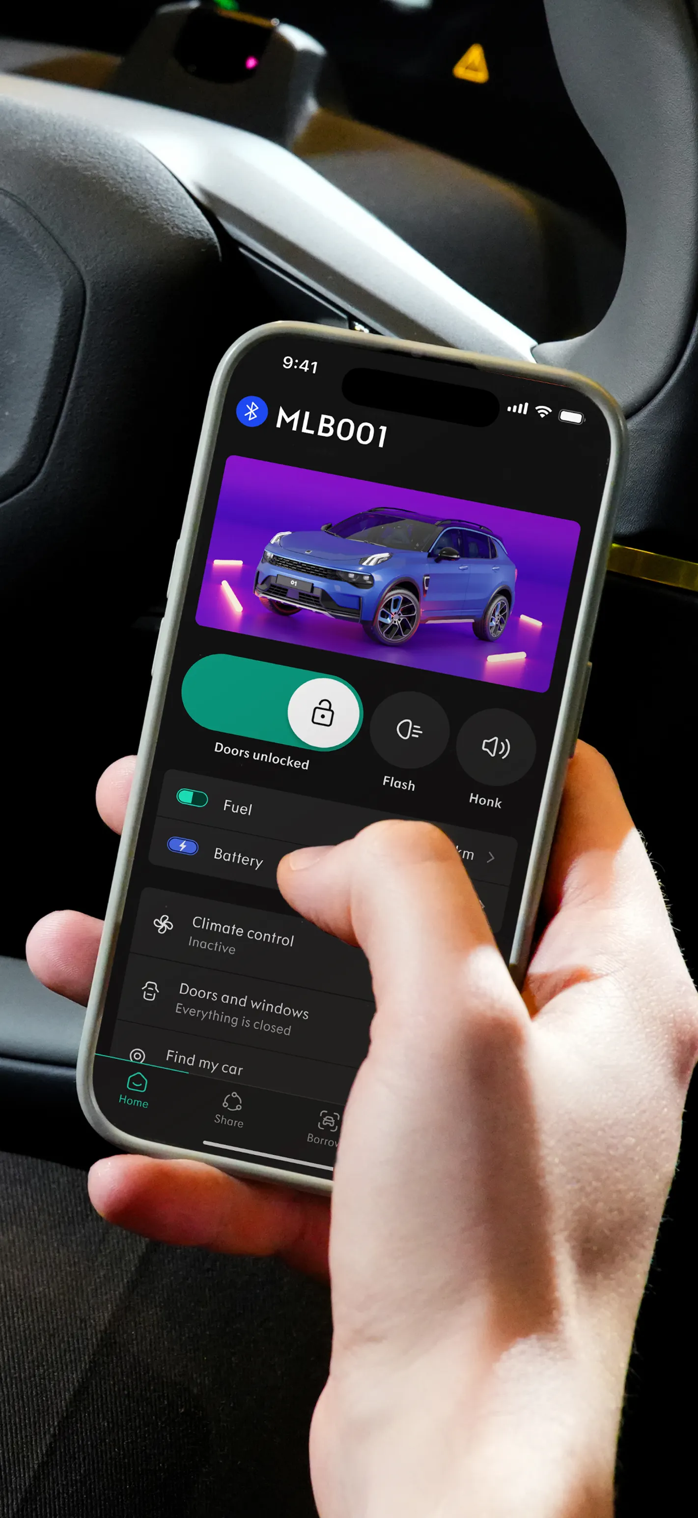
Two phones next to each other showing the Lynk & Co app.
Image showing the Climate control functionality in action where the air animation is visible.a
An illustrative picture of the flash lights functionality from the Lynk & Co app.
A top picture of the Lynk & Co 01 car.

Deliverables

The redesigned Lynk & Co features a dynamic interface with easy access to all connectivity controls. It also allows non-car owners to borrow cars from other customers within the same app. The interface adapts to each user's profile, prioritising the most relevant features based on whether they own a car or not.

Research

After analysing user feedback from testing, workshops, surveys, and forums, we identified significant usability issues with the original Lynk & Co app. Users reported critical bugs, a confusing layout, and controls buried too deeply within the app.

The chatbot, intended to connect the car and the app, was ineffective and slowed down user interactions. Additionally, car sharing was less popular than expected. Instead, users preferred easy-to-use and stable connectivity features.

Combined mockup of several screens showcasing the Lynk & Co connectivity features.

Vision

To create a new app from scratch, it was crucial for the team to share a common vision. We achieved this through a series of workshops with management, the brand team, and other stakeholders, who provided valuable feedback during the concept and design process.

Mobility that’s made for you

One app that does it all

The all-new Lynk & Co app features a dynamic home screen that prioritizes and displays relevant information exactly when you need it. For car owners, this means direct access to connectivity controls like locking and unlocking, along with reminders for upcoming car sharing bookings. Non-car owners will find details about car sharing and a quick way to locate available nearby cars.

Connectivity

Connectivity was a key focus in this redesign. Customers asked for efficiency, transparency and reliability. Most connectivity features are now easily accessible on the home tab. Users can check their car's status, such as whether the doors are locked, where the car is parked, or remotely activate climate control. All located in one place without needing to dig through the app.

Lynk & Co app showing the home tab with connectivity features.Lynk & Co app showing the battery feature.Lynk & Co app showing the Climate control onboarding flow.Lynk & Co app showing the Climate control feature.Lynk & Co app showing a warning bottom sheet.Lynk & Co app showing the Status & warnings feature.Lynk & Co app showing the Find my car feature.Lynk & Co app showing the home tab with connectivity features while one of the doors is opened.

Design language

Before starting this project, we completed a brand redesign. We updated our design language, colour palette, and brand values. Key achievements include a flexible new colour system, design tokens and improved accessibility, enhancing both our the website and app.

Image showcasing an example of the map functionality where a line is drawn between a person and a car.
The Lynk & Co color system displayed.
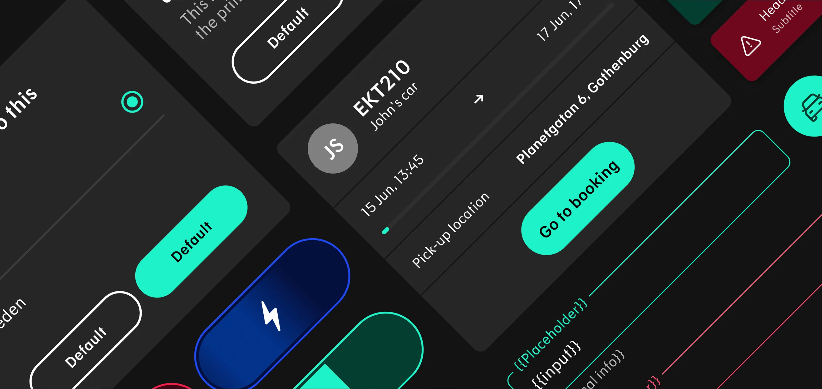
An image showcasing the CTA variants used in the Lynk & Co app.

Design System

We integrated these brand values into our new Design System for the app. This scalable and adaptable component library offers designers and developers a consistent foundation. With design tokens and motion documentation, it explains how components work and behave.

Car Sharing

What sets the Lynk & Co app apart is its car-sharing feature. Like other car-sharing apps, it offers a map of available cars for non-car owners to book. Once booked, users can access the car for the agreed time. This sharing experience has been revamped and enhanced in the new app.

Lynk & Co app showing a map with cars available to borrow.Lynk & Co app showing an onboarding flow for Car Sharing.A mockup showing the calendar view used in the Car Sharing section of the Lynk & Co app.The Lynk & Co app displaying an upcoming booking.The Lynk & Co app displaying showing a booking that is about to start.The Lynk & Co app displaying the process of recording the state of a car before a car sharing booking can be started.The Lynk & Co app displaying an ongoing booking.

More Work —

More Work —

More Work —

More Work —

More Work —

More Work —

More Work —

More Work —

More Work —

More Work —

More Work —

More Work —

More Work —

More Work —

More Work —

More Work —